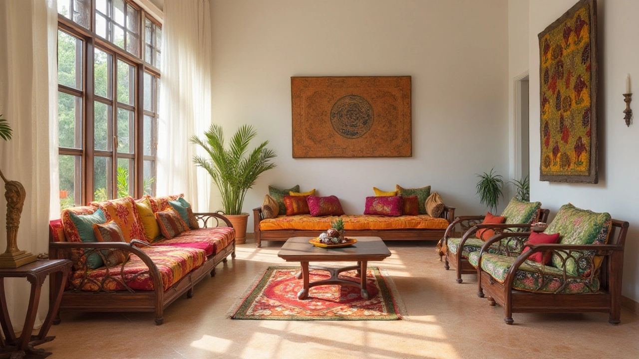
Color Coordination Made Simple: Your Guide to a Cohesive Home
Ever walked into a room and felt something was off, even though you liked every piece? Chances are the colors aren’t talking to each other. Getting the hues to work together doesn’t have to be a design class – just a few smart steps and you’ll see instant harmony.
How to Choose a Base Color
Start with one color that you love and let it set the tone. This could be a wall paint, a floor tile, or a big piece of furniture. Keep the base neutral if you’re unsure – whites, light greys, and soft beiges give you room to play. Once you lock the base, pull a few accent shades from the same palette. Use a color wheel app or simply hold two samples together; if they look good side‑by‑side, you’re on the right track.
Balancing Tiles, Paint, and Accessories
Tiles are the foundation of any room, so treat them like your base color. If you pick a grey tile, match it with a slightly lighter paint on the walls and add a pop of colour in cushions or artwork. Don’t overdo the accents – one or two bold pieces are enough to keep the space lively. When you buy a new tile, bring home a paint chip and test it on a small wall area; this instantly shows if the combo works.
Lighting plays a quiet but huge role. Warm LED bulbs bring out earthy tones, while cool whites highlight blues and greens. Switch the bulbs in a room before you finalize paint – you’ll see the true vibe. If a room feels too stark, add a floor lamp with a warm shade to soften the palette.
Budget‑friendly tricks can upgrade the look without breaking the bank. Paint the back of shelving units a contrasting colour for a surprise pop. Use removable wallpaper on a single wall to introduce pattern without re‑tiling. Even a matching rug can tie floor, wall, and furniture together in seconds.Common mistakes to avoid: clashing too many bright colours, ignoring natural light, and picking accessories that don’t share a common undertone. When in doubt, step back and look at the room from a distance; your eyes will pick up mismatches faster than your brain.
Quick hack: the 60‑30‑10 rule. Fill 60% of the space with your base colour, 30% with a secondary shade, and 10% with an accent. This simple formula instantly creates balance, whether you’re using tiles, paint, or décor items.
Another tip is to sample before you buy. Grab a small tile, a paint swatch, and a fabric swatch. Lay them on the floor together for a few hours. Sunlight and indoor lighting will change how they look, and you’ll avoid costly re‑do’s.
Finally, keep a visual notebook or phone album of colour combos you love. When you’re shopping for new tiles at KSR Ceramics, you can match them straight to your saved palette. This makes the whole process faster and ensures every new piece fits your vision.
Color coordination isn’t magic – it’s just a habit of checking how each element relates to the others. Follow these steps, stay playful, and watch your rooms transform from ordinary to inviting.
Timeless Flooring Colors that Blend with Any Decor
Choosing a floor color that blends seamlessly with various styles and schemes is essential to home design. By opting for versatile shades such as warm neutrals, timeless whites, and classic wood tones, homeowners can create spaces that adapt beautifully to personal taste and evolving trends. These colors complement nearly any decor while providing a foundation that ties together surroundings in a cohesive manner, making your home ready for future redesigns.
Continue Reading