Curtain Color Ideas to Transform Any Room
Choosing the right curtain color can change a room in minutes. It’s not just about matching the wall – the hue of your curtains influences light, mood and how furniture looks. Below you’ll find simple steps to pick a shade that works for any space.
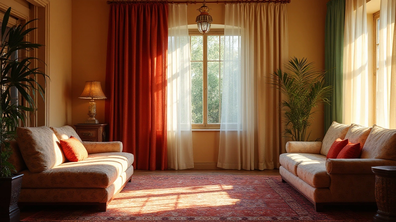
First, check how natural light hits the room. Bright rooms handle darker curtains without feeling gloomy, while dim rooms benefit from light, reflective fabrics that bounce light around. A quick test: hold the fabric up to the window at noon and see if it still feels airy.
Next, think about the room’s purpose. A bedroom often needs a calm, soothing palette – soft blues, muted greys or warm beiges. A living room, on the other hand, can handle bolder tones like deep teal or charcoal, especially if you want a focal point.
Using the color wheel helps avoid clashing combos. Complementary colors (opposite each other) create striking contrast – try orange curtains with a teal wall. Analogous colors (next to each other) give a harmonious feel – a cascade of warm reds, oranges and yellows works well in a cozy lounge.
How to Pick the Right Color
Start with a single element you already love – a rug, a sofa or even a tile pattern. Pull a color from that piece and use it as a base for your curtains. If you have a KSR Ceramics marble‑look tile in the bathroom, a soft ivory or pale grey curtain will echo the stone without competing.
Test fabric swatches against the wall and flooring. Hold them up for a few minutes, then step back. If the color looks flat, try a slightly lighter or darker shade. Remember, fabrics can look different under artificial light versus daylight, so check both.
Trending Curtain Colors for 2025
For 2025, designers are leaning toward nature‑inspired tones. Earthy olive, muted terracotta and deep sapphire are popular for living rooms. In bedrooms, pastel sage and warm sand are gaining traction because they promote relaxation. If you love a modern look, go for crisp white or charcoal paired with metal hardware.
Another trend is “dual‑tone” curtains – a lighter interior layer with a darker exterior panel. This lets you enjoy privacy at night and let sunshine in during the day. Pair a soft beige inner curtain with a charcoal outer shade for a sleek, adaptable look.
Finally, think about fabric texture. Heavy linen in a natural hue adds depth, while sheer voile in pastel tones keeps the space light. Mix textures to add visual interest without overwhelming the colour palette.
Putting these tips together means you’ll pick a curtain colour that feels intentional, matches your tiles and furniture, and stays on trend. Want more ideas? Browse KSR Ceramics for tile inspirations and see how the right curtain colour can tie everything together.
Choosing the Right Curtain Color for Your Walls
Deciding whether curtains should be darker or lighter than walls is pivotal in home decor. The choice can set the mood of a room, affect the perception of space, and enhance or diminish natural light. While darker curtains offer a grounding effect, lighter ones can brighten up a space. This article will explore the factors to consider when selecting curtain colors to harmonize or contrast with your walls.
Continue Reading