Wall Art Mistakes You’re Probably Making (And How to Fix Them)
When you hang a picture or a set of panels, it’s easy to overlook tiny details that end up looking off. Those details can make a room feel sloppy instead of stylish. Below you’ll find the most common slip‑ups and quick fixes you can apply right now.
Placement Errors That Kill the Vibe
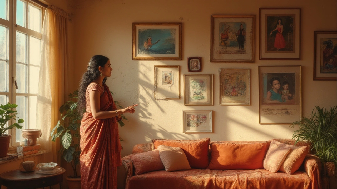
First, don’t let eye level dictate every decision. The classic “hang art at 57 inches” works for most rooms, but a low‑ceiling lounge or a tall hallway needs a different approach. Measure the wall space, then step back and picture the overall balance. If a piece sits too high, the room feels disconnected; too low and you’ll keep bumping into it.
Another mistake is ignoring the furniture layout. Art should relate to the sofa, bed, or desk it’s above. A good rule is to leave a 6‑8 inch gap between the top of the furniture and the bottom of the artwork. This gap creates a visual bridge that ties the two elements together.
Don’t forget symmetry. If you hang two identical frames, keep the distance between them equal on both sides of a focal point. Uneven spacing draws the eye in the wrong direction and makes the setup look unfinished.
Choosing the Wrong Size, Style, or Frame
Oversized art in a small room overwhelms the space. Conversely, tiny pieces on a big wall look lost. Use the “two‑thirds rule”: the art (or group of pieces) should cover about two‑thirds of the wall’s width. This keeps the visual weight balanced.
Mixing styles without a connecting element is another pitfall. A modern abstract next to a vintage oil painting can clash unless you use a unifying frame or colour palette. Pick frames that echo each other—same finish, similar thickness—or use a common colour in the artwork to tie them together.Colour mistakes happen when the art’s hues fight the room’s palette. If your sofa is cool‑blue, a warm‑red painting will create tension unless that red is muted or echoed elsewhere. Pull a small colour from the artwork into pillows or a rug to smooth the transition.
Lastly, don’t shy away from proper lighting. A piece in a dim corner will never shine. Add a picture light or place a floor lamp nearby to highlight texture and colour. Even a simple LED strip can make a big difference.
Fixing these errors doesn’t require a full redesign. Start by assessing the wall’s dimensions, then rearrange or replace frames until the composition feels right. Remember, art is meant to enhance the space—not dominate it.
Now that you know the most common wall art mistakes, go ahead and give your walls a quick audit. Adjust the height, check the spacing, match the style, and add light where needed. In a few minutes you’ll turn a bland wall into a focal point that feels intentional and inviting.
Where Not to Hang Pictures: Places to Avoid for Wall Art in Your Home
Learn where you shouldn’t hang pictures and why it matters. Discover tips that’ll save your walls, your artwork, and even your sanity. Get real advice without the fluff.
Continue Reading