Colors That Inspire Wealth: Wallpaper Trends You Need to Know
Have you ever walked into a room and immediately felt like a million bucks? It might just be the colors around you doing the trick. Colors have this fun way of playing with our emotions and can even inspire a sense of wealth and prosperity. It's kind of like the power of suggestion in full swing, all thanks to good ol' color psychology.
So, what's the deal with wealth and colors? Well, certain shades have been long associated with riches and abundance. Think about those deep, luxurious greens or the regal feel of purple. These aren't just random picks; they have roots in history and a bit of psychological backing too.
But hey, times change, right? While classic wealth colors still hold their charm, there are modern twists popping up in wallpaper trends. It's not just about what the colors traditionally stood for, but how they fit into our own personal spaces—adding that extra layer of richness to our homes.
Before diving deep into a sea of paint or paper samples, think about what vibes you want your space to give off. It's not just about aesthetics; it's about creating an environment that feels prosperous and welcoming. Yup, all that's possible with the right color choices!
- Understanding Color Psychology
- Classic Wealth Colors
- Modern Takes on Wealth Colors
- Matching Colors to Your Space
- Practical Tips for Choosing Wallpaper
Understanding Color Psychology
So, what exactly is color psychology, and why does it matter when picking out wallpaper? Well, it's the study of hues as a determinant of human behavior. Simply put, it's how we react to different colors on an emotional level. This can totally influence our mood, feelings, and even the decisions we make.
Each color has its own unique vibe. Let's break it down a little: green is often linked with wealth, balance, and growth. It's no wonder banks and financial institutions love it. Purple, on the other hand, has this rich history of being associated with royalty and luxury. Makes sense that a purple accent in your home gives off that high-end, indulgent feel, right?
Why Colors Matter
Colors have been used for ages to symbolize different meanings. In the world of feng shui, colors can bring harmony and prosperity when used correctly in a space. For instance, using a lot of reds and golds can create a prosperous energy. Meanwhile, blue can feel calming and bring a sense of trust, which is another reason financial entities might opt for shades of blue.
Psychology Meets Design
The cool part is how color psychology isn't just a theory—it's super practical, especially in home design. When you're choosing wallpaper, getting the right shade can actually enhance how a room functions. Need a cozy, welcoming foyer? Maybe try some warm earth tones. Want a powerful and motivating office space? Rich blues and greens could do the trick.
And while this might sound a bit scientific, it's honestly more about your personal touch. These colors need to work with your style and what makes you feel comfy and inspired. So, think about the colors for wealth and how you want them reflected in your space!
| Color | Emotion | Associated Wealth |
|---|---|---|
| Green | Balance, Growth | Yes |
| Purple | Luxury, Royalty | Yes |
| Gold | Glamour, Success | Yes |
| Red | Energy, Passion | Sometimes |
By understanding these color dynamics, you can play around with wallpaper trends that not only look fab but also might bring that extra sprinkle of prosperity into your life!
Classic Wealth Colors
Some colors have a long-standing rep for being linked with wealth and prosperity—think of them as the OGs of the color world when it comes to evoking those rich vibes. The most classic of all? Gold might come to mind first. Rightfully so, since gold has always been a direct symbol of wealth. Having gold tones in your wallpaper can give a room that plush, prosperous feel. It's like a visual shout-out to opulence, without overdoing it.
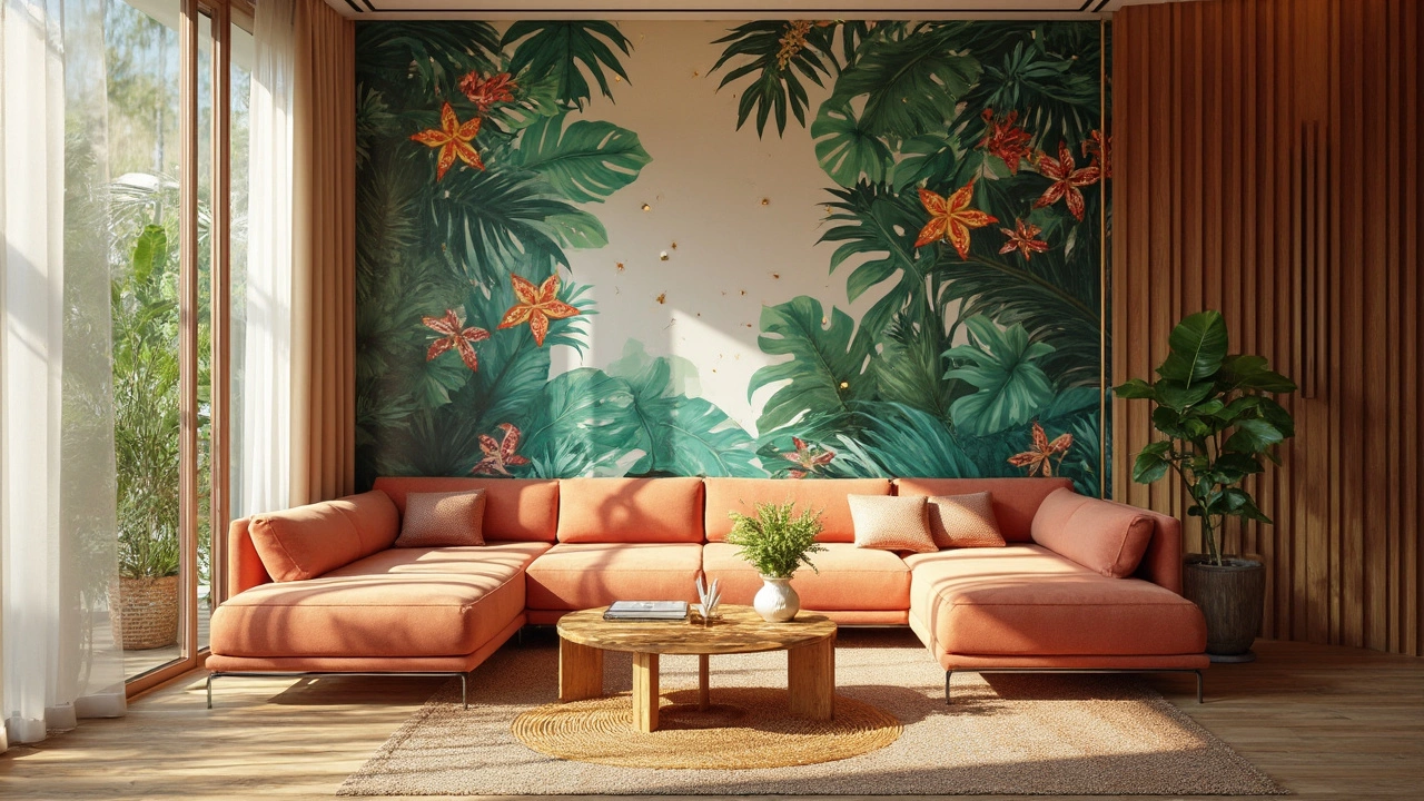
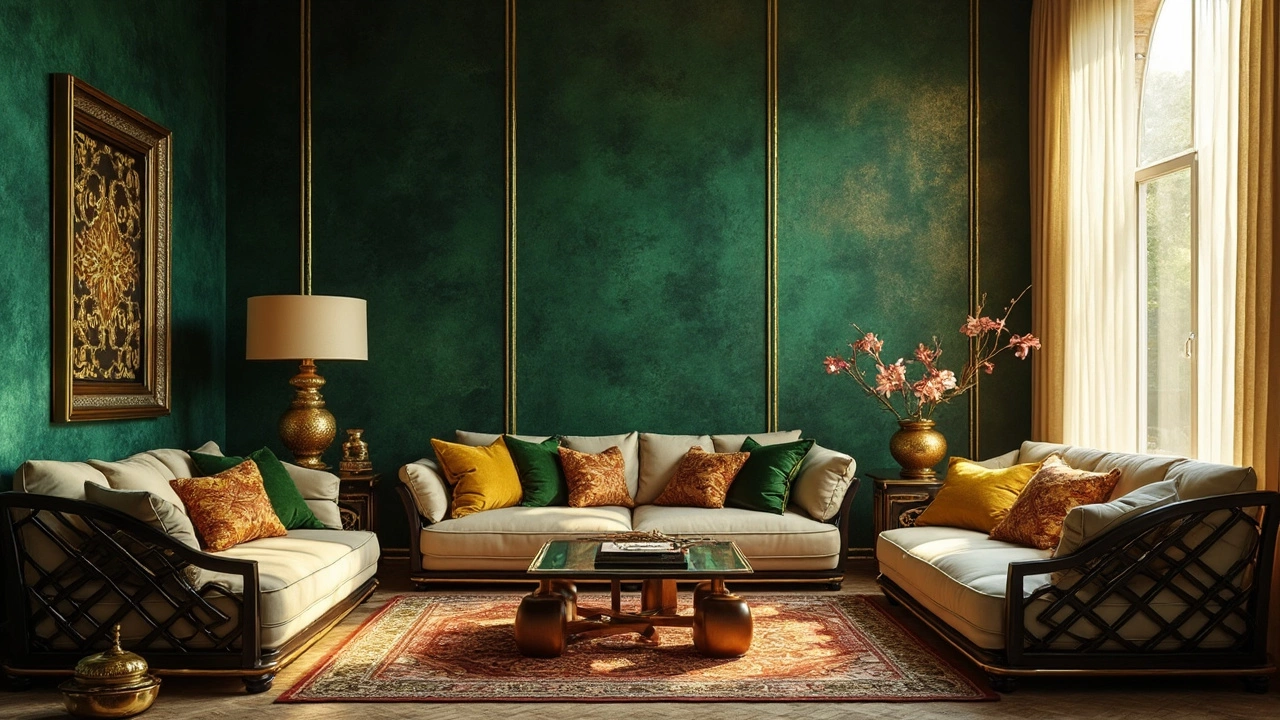
Another big hitter is Green. Green is deeply tied to money and growth. Historically, it's been seen as the color of fertility and abundance. If you're looking to spread that energy throughout a room, consider bold green shades. Whether it's an emerald tone or a soft mossy hue, green brings life and prosperity into any space.
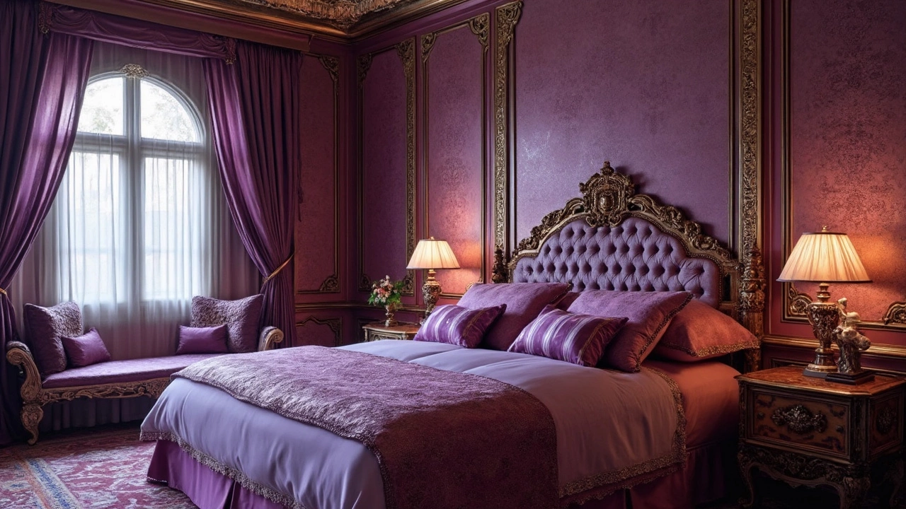
Then, we have Purple. Ever noticed how purple hues are often associated with royalty? Back in the day, purple dye was super expensive to produce. So, naturally, only the rich and noble could afford this regal color. Adding purple to your decor can make a space feel elegant and high-class.
Combining Classic Colors
Using these classic wealth colors together can be a winning strategy. A green room with gold accents or vice versa? Talk about doubling down on that wealthy aura! Just be mindful of balance so your space doesn't become overwhelming.
It's also important to notice how different shades of each color can affect the overall vibe. A darker tone may feel more mysterious and intense, while lighter versions can introduce a relaxed and open feel.
Interesting Fact: The Color of Wealth
| Color | Association | Historical Use |
|---|---|---|
| Gold | Wealth, Luxury | Rich households in ancient times |
| Green | Growth, Money | Banknotes, and ancient palaces |
| Purple | Royalty, Power | Noble robes and insignias |
Choosing the right wallpaper that highlights these colors for wealth can be a game-changer for your home decor. Not only will your space have a more refined look, but it'll also inspire a sense of prosperity every time you walk in.
Modern Takes on Wealth Colors
Alright, let's talk about how today’s wallpaper trends are shaking things up when it comes to colors that inspire wealth. With a blend of technology and creative innovation, modern palettes are giving the classic wealth colors a fresh twist, perfectly suited for contemporary homes.
First off, we have what’s known as 'Muted Opulence.' This trend takes your classic gold and silver, but tones them down a notch. You’ll see wallpapers that sport gold with a matte finish or silvers that are almost smoky, creating a subtler, sophisticated sparkle rather than gaudy bling.
Warm Neutrals with a Luxurious Feel
Neutrals might not scream wealth at first glance, but when you pair those creamy beige or warm taupe backgrounds with rich, textured patterns, you've got a recipe for understated luxury. Picture a soft eggshell color accented by a velvety, dark brown design. It's like sipping a latte in a high-end cafe—calm yet extravagant.
Green: The New Power Color
The world has seen a resurgence of green in all its shades. From emerald to olive, this color brings the essence of nature and wealth rolled into one. Particularly with eco-friendly living on the rise, green has become a strong symbol of a prosperous future. It's said that adding strips of green wallpaper in your office (even if it’s a cozy corner of your kitchen) can enhance creativity and focus.
- Emerald: Often associated with creativity and productivity.
- Olive: Known for settling the mind, great for study spaces.
Getting Creative with Blue
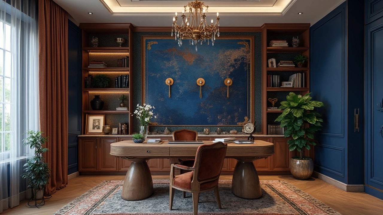
Don't sleep on blue, especially with bold shades trending. Deep navy and royal blues are making waves. They're perfect for creating a serene environment that still oozes a sense of power and success. Plus, it doesn’t hurt that these hues generally pair well with a ton of other colors, making them versatile for any room.
Smart Color Combinations
Combining traditional and modern elements can create an effect that brings the best of both worlds. Think of pairing a classic wealth color like royal purple with a snazzy contemporary shade like aqua. Or, mix a subdued gold pattern with a rich indigo base to add depth and character.
The Detailing Matters
Last but not least, the texture and pattern of your wallpaper matter just as much as the color. Intricate patterns or textures can create a sense of depth and dimension, enhancing that feeling of wealth and comfort. Look for wallpapers that use innovative materials—like those with a slight metallic sheen—to catch and play with light, making your space appear more dynamic.
Matching Colors to Your Space
Alright, so you've got a feel for those colors for wealth and are ready to sprinkle some financial good vibes throughout your home. But where do you start? The key is to match the colors to your space in a way that feels both authentic and stylish.
Consider Your Room's Purpose
Not every room should get the same treatment. Think about the function of each space. For example, deep greens or dark blues can bring sophistication to a study or home office, creating a sense of prosperity and focus. Bedrooms might benefit from softer gold or warm beige tones that promote relaxation while still evoking a sense of luxury.
Room Size and Lighting
The size of the room and how much natural light it gets can totally affect your color choice. In smaller rooms, light tones can make the space feel bigger and more open, while larger rooms may handle darker shades that scream elegance, like rich purples or navy blue. Always test your color choices under different light conditions before committing.
Accent and Balance
You don't have to drown a room in a single color to get that wealth-inspiring vibe. Balance is crucial. Use wallpaper with metallic accents or patterns to add depth without overwhelming the space. Pair plush textiles like velvet or silk with your chosen wallpapers, and you've got yourself a winning combo.
Quick Tips for Wallpaper Choices
- Choose patterns that are not too busy for a more classic wealthy look.
- Consider textured wallpapers to add a layer of richness.
- Combine neutral tones with your wealth colors for a balanced design.
- Mix and match with decorative items in similar hues to tie the room together.
By thinking strategically about how you match these colors to your space, you're not just sprucing up your decor; you're creating an environment that feels abundant and welcoming. Don't forget, in the end, it's about setting the mood and expressing your taste!
Practical Tips for Choosing Wallpaper
Selecting the right wallpaper can transform your space into a sanctuary of prosperity. If you're eyeing those wealth-inspiring hues, here are some handy tips to get you started.
Consider Your Space
First off, think about the room you're working with. A bold, deep green wallpaper might be fantastic in a study for that classic wealth vibe, but it could seem overwhelming in a small bedroom. Align your color choice with the room's purpose and the feeling you want to evoke.
Lighting Matters
Lighting plays a huge role in how color is perceived. If your room floods with natural light, you can go for darker, richer tones without worrying about making the space feel cramped. In darker rooms, lighter shades might do the trick to reflect any available light and make the space feel more open.
Texture and Pattern
It's not just about the color; texture and pattern come into play too. A metallic sheen can add that extra touch of opulence, a key element of wallpaper trends today. Patterns like damask or abstract geometric designs are excellent choices if you want to add interest without cluttering your visual field.
Sample Before You Decide
Before making a commitment, grab some samples. Stick them in your room and live with them a bit. See how the colors change at different times of the day and how they make you feel. It’s a simple step that can save you from a regretful decision.
Don’t Forget Balance
If you’re going big with one wall, think about how the other elements in the room will balance it out. Earthy tones or neutral shades in furnishings and decor can complement those bold, wealth-inspiring colors well.
DIY or Pro Help?
Finally, consider whether this is a DIY project or if you need professional help. Some wallpapers are tricky to hang evenly, and mistakes can be costly. If you’re going for intricate patterns or textured materials, it might be worth bringing in the pros.
There you go! With these practical tips, you’ll be well on your way to crafting a home environment that radiates wealth and style.