Happy‑Boosting Curtain Colors: Choose Shades That Lift Your Mood
When you pull the curtains aside each morning, the first thing you see should spark a smile. Curtain colors are the fabric hues that frame a room and subtly steer how you feel inside. While many pick shades for style or matching furniture, research into Color psychology the study of how different wavelengths influence emotions and behavior shows that the right curtain hue can actually boost happiness, reduce stress, and even encourage productivity.
Why hue matters: the science behind happy rooms
Color isn’t just a visual treat; it triggers brain pathways linked to mood. Warm wavelengths (reds, oranges, yellows) activate the limbic system, often lifting spirits and energizing the body. Cool tones (blues, greens, purples) tend to calm the nervous system, creating a relaxed but content atmosphere. Neutrals (beiges, greys, off‑whites) act as a balanced backdrop, allowing other design elements to shine without overwhelming the senses. Understanding these basics equips you to match curtain shades with the emotional vibe you want in each space.
Warm curtains that spark joy
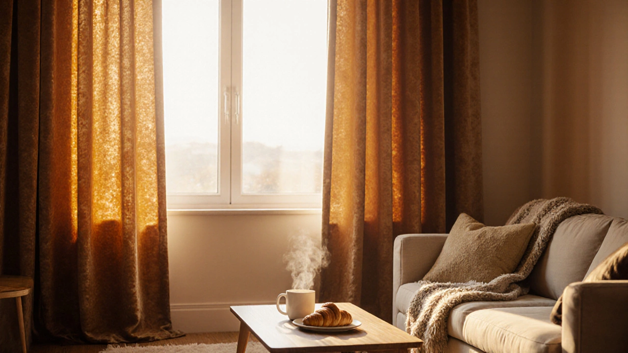
Sun‑kissed living rooms and breakfast nooks thrive on warm curtains. A deep Warm color any hue ranging from ruby red to golden amber that evokes heat and vitality drape can turn a dull corner into a cheerful focal point. Studies by the University of Texas found that participants in rooms painted with soft orange reported a 15 % increase in positive affect compared with neutral walls.
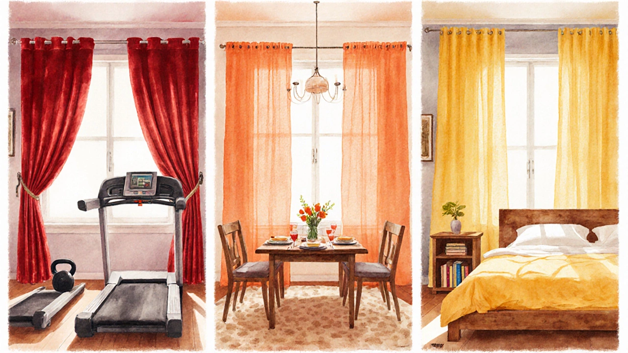
- Red: stimulates excitement; ideal for creative studios or home gyms where you need an energy boost.
- Orange: balances stimulation with comfort; perfect for dining areas where conversation flows.
- Yellow: mirrors sunlight; works wonders in bedrooms with limited natural light to improve mood.
When choosing warm curtains, consider fabric weight. Heavier velvets deepen the color’s richness, while sheer linens keep the vibe airy yet uplifting.
Cool curtains that calm and still uplift
Don’t mistake calm for boring. Cool curtains can create a serene backdrop that subtly lifts spirits by reducing anxiety. A Cool color shades such as blue, green, or teal that promote relaxation without dampening happiness can be especially effective in spaces dedicated to unwinding, like bedrooms or home offices.
- Blue: lowers heart rate and improves focus; great for study rooms.
- Green: echoes nature, fostering a sense of renewal; ideal for living rooms with indoor plants.
- Teal: blends blue’s calm with green’s vitality; works well in bathrooms for a spa‑like feel.
Light‑filtering fabrics let daylight mingle with the hue, amplifying the soothing effect while still keeping the room bright enough to feel happy.
Neutral shades for versatile happiness
Neutral curtains are the chameleons of the window world. They don’t scream emotion, but they provide a clean canvas that lets other colors-artwork, furniture, accent pillows-do the emotional heavy lifting. A well‑chosen neutral can still influence mood through texture and subtle undertones.
- Beige: offers warmth without saturation; perfect for modern minimalist spaces.
- Soft grey: adds a sleek, contemporary feel; works well with bold décor accents.
- Off‑white: reflects light best; ideal for small rooms that need an airy, uplifting vibe.
Pair neutral curtains with bright accessories like colorful tie‑backs or patterned trim to inject cheer while preserving flexibility.
How natural light and room function shape the choice
Natural light sunlight entering through windows, affecting perception of color and mood plays a decisive role. In a sun‑filled sunroom, soft pastels or light neutrals enhance the glow, while in a windowless study, richer warm tones compensate for the lack of daylight. Moreover, the room’s primary function guides the hue:
- Living room: prioritize social energy-warm or vibrant cool colors.
- Bedroom: aim for relaxation-muted blues, greens, or gentle neutrals.
- Kitchen: encourage appetite and conversation-cheerful yellows or fresh greens.
Remember that curtains also act as a filter. Dark, blackout fabrics block external light, making any hue appear deeper; sheer fabrics let the sun’s hue shine through, altering the perceived color throughout the day.
Practical checklist: picking curtains that make you happy
- Identify the room’s purpose and the mood you want to nurture.
- Assess the amount of natural light the space receives.
- Choose a color family (warm, cool, neutral) that aligns with the desired emotion.
- Select fabric weight based on privacy needs and how you want the color to read.
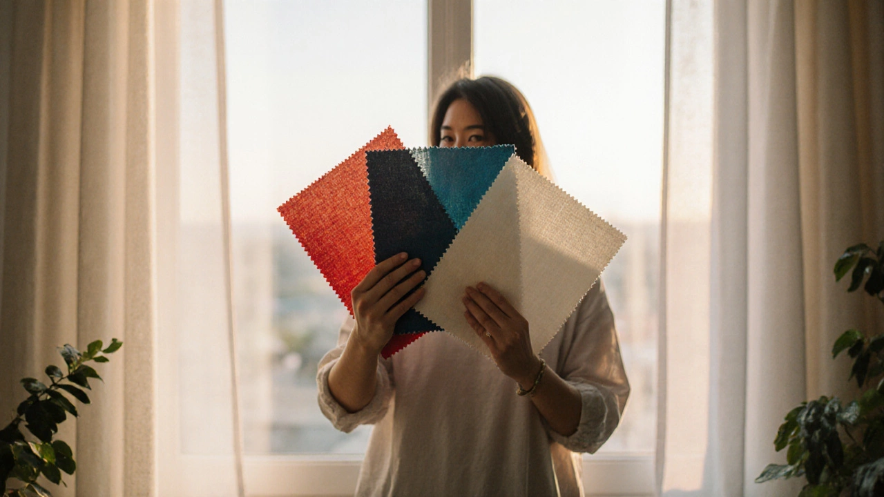
- Test sample swatches against existing décor and under different lighting conditions.
- Consider accessories-ties, valances, or patterned liners-to add a pop of happiness.
- Install and observe how the space feels over several days; adjust if the vibe isn’t right.
Quick reference table
| Color family | Typical shades | Primary mood effect | Best rooms |
|---|---|---|---|
| Warm | Red, orange, yellow | Energy, optimism, social connection | Living room, dining area, home gym |
| Cool | Blue, green, teal | Calm, focus, rejuvenation | Bedroom, home office, bathroom |
| Neutral | Beige, grey, off‑white | Balance, flexibility, light enhancement | Any space that uses accent colors elsewhere |
Mini FAQ
Do bright colors always make a room feel smaller?
Not necessarily. Bright warm shades can actually expand a space when paired with light‑colored walls and reflective surfaces. The key is balance-use bold curtains as accent pieces rather than overwhelming the entire window.
Can I mix warm and cool curtains in the same house?
Absolutely. Different rooms serve different functions, so mixing hues creates a tailored emotional map throughout your home. Just keep the overall palette cohesive by using common undertones or similar fabric textures.
How much does natural light affect the perceived color of curtains?
A lot. Sunlight can brighten cool tones, making them appear greener, while warm shades may look more muted. Test swatches at different times of day to see the true effect.
Are blackout curtains still able to influence mood?
Yes, because the fabric’s dye still interacts with any ambient light-street lamps, TV glow, or morning sunrise. Choose colors that feel comforting even in low‑light conditions, like deep blues or warm charcoal.
What’s the easiest way to test curtain colors before buying?
Order fabric swatches or cut small pieces from a sample roll. Hang them on a tension rod and observe how they look morning, noon, and evening. This real‑world test beats online photos every time.