Color Psychology: Boost Your Home’s Mood with the Right Hues
Ever walked into a room and instantly felt relaxed or jittery? That’s color psychology at work. The shades on your walls, floors, and furniture can lift your spirit, calm your mind, or spark creativity. Knowing a few basics lets you design spaces that actually support how you want to feel every day.
Why Color Affects How You Feel
Our brains react to colors long before we think about them. Warm tones like red and orange fire up energy centers, while cool blues and greens calm the nervous system. Researchers link these reactions to ancient survival cues – bright red signals danger, green signals safety. Modern design uses those instincts to shape moods without a single word spoken.
Practical Ways to Use Color Psychology in Your Home
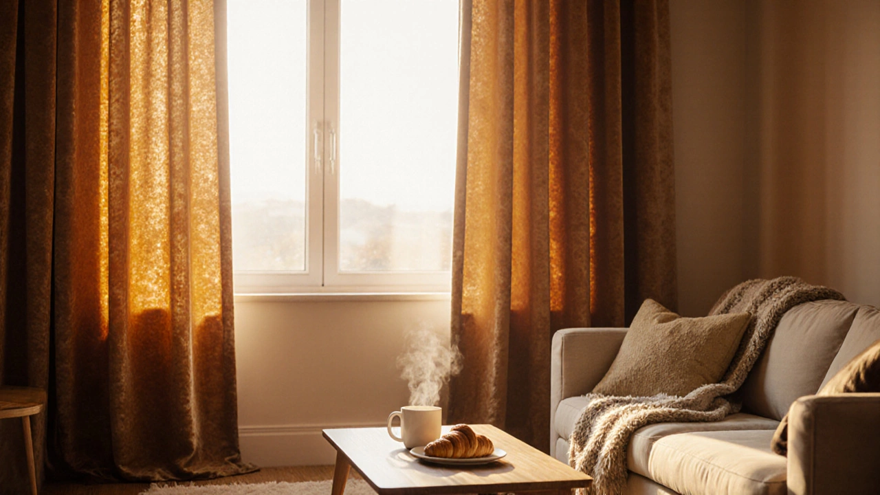
Start with the rooms you spend the most time in. In the living room, a soft teal or muted sage can make conversations flow smoothly and keep stress low. If you love movie nights, a deeper navy adds drama without feeling cramped. Pair the walls with light‑reflecting ceramic tiles in similar hues to tie the look together.
For the bedroom, think sleepy. Light lavender, pastel pink, or gentle gray create a restful backdrop that encourages melatonin production. Keep lighting warm and avoid bright whites that can keep the brain alert. If you need a pop of energy, add a single accent wall in muted mustard – just enough to inspire without overwhelming.
The kitchen thrives on appetite‑boosting colors. Warm yellows and soft oranges stimulate hunger and conversation. Choose backsplashes or floor tiles in those shades to keep the space lively. Pair them with neutral countertops so the color stays inviting rather than loud.
Bathrooms benefit from clean, fresh vibes. Light blues and aqua mimic water, making the space feel spa‑like. Use these tones on wall panels or tile grout to reinforce the sense of cleanliness. A splash of green in towels or accessories adds a touch of nature without clashing.
If you have a home office, focus on productivity. Light gray or muted teal reduces distractions, while a single bright accent like a citrus orange can spark creativity during brainstorming. Keep the overall palette subdued to avoid eye strain during long work sessions.
Don’t forget the power of texture. Rough stone, glossy tiles, and soft fabrics all reflect color differently. A glossy white tile brightens a room, while a matte finish absorbs light for a cozier feel. Mix textures to add depth without adding extra colors.
Lastly, test before you commit. Paint a small swatch on the wall, live with it for a few days, and notice how your mood shifts. The same goes for tile samples – lay them on the floor and walk around. Small experiments save money and guarantee you love the final result.
By matching colors to the feelings you want in each space, you turn ordinary rooms into mood‑boosting zones. Simple tweaks to paint, tiles, and accessories can make a huge difference without a full renovation. Start playing with hues today and feel the change yourself.
Happy‑Boosting Curtain Colors: Choose Shades That Lift Your Mood
Discover which curtain colors naturally boost happiness, how warm, cool and neutral shades affect mood, and practical tips for picking the perfect happy‑boosting curtains.
Continue Reading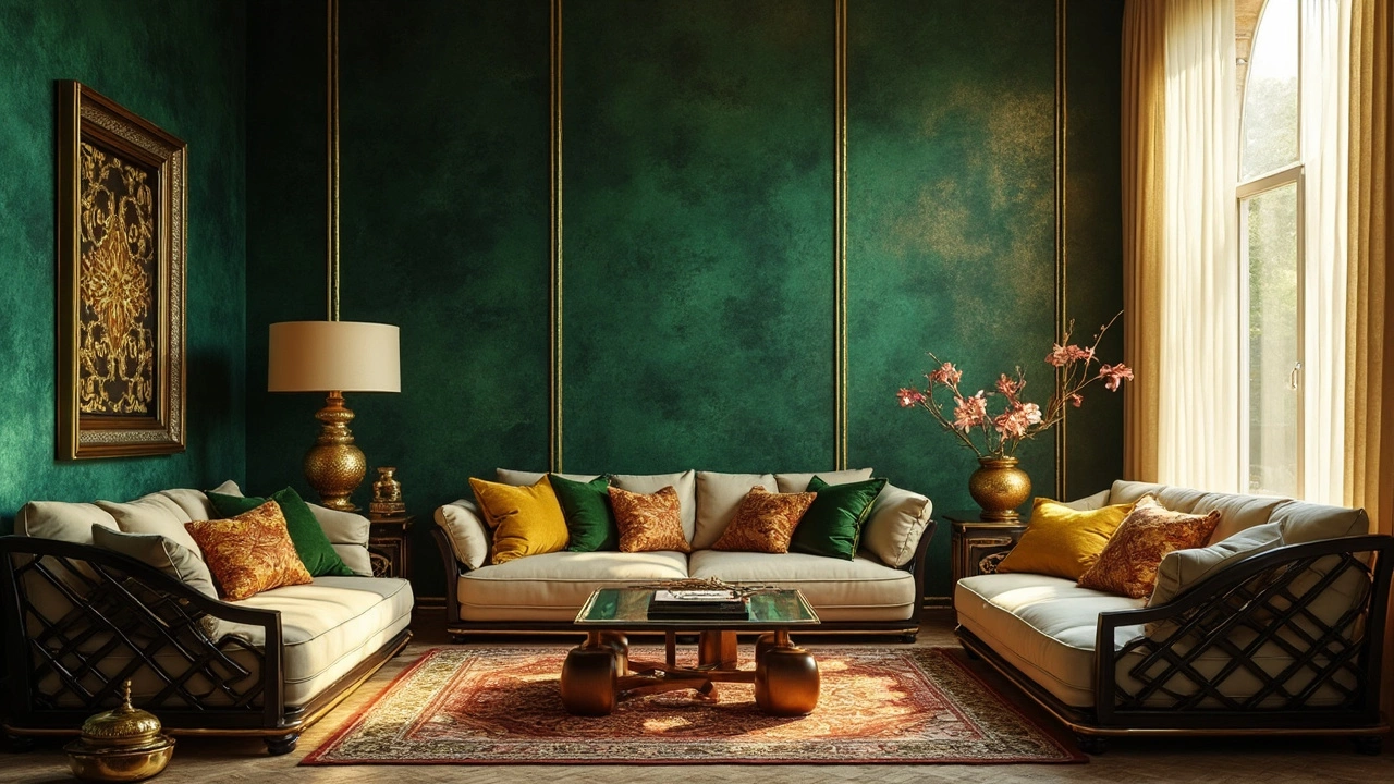
Colors That Inspire Wealth: Wallpaper Trends You Need to Know
This article delves into how specific wallpaper colors can evoke feelings of wealth and prosperity. Understanding the psychology of colors can help you choose shades that promote success and financial well-being. Featuring tips on incorporating these colors into your home decor, the article provides practical insights into transforming spaces. Discover which colors are traditionally associated with wealth and learn how modern trends integrate these hues.
Continue Reading